Role: Lead Experience Designer
Responsibilities: UX, research, strategy, stakeholder management, work stream management
Every day, almost a million of customers get on top of their money on ANZ Internet Banking, transacting $14 billion AUD fortnightly.
As part of the platform upgrade to one of the biggest online banking services in Australia, we took the opportunity to uplift the homepage and view accounts experience, two of the highest traffic features on Internet Banking.
The team
I worked with my design team of two UI designers, UX designer and a content designer, we carefully planned the work with four product teams across two tribes. My contribution to the project was
Facilitate conversations between our design team and the product teams
Establish collaboration with the designer in the Sales tribe to ensure the design achieve the objectives of both tribes
Review and provide feedback on design artefacts
Conduct research with the team and synthesis
Liaise with product teams to priortise items for delivery
Objectives
Our objectives from a design and product perspective are
Design
Address customer pain-points in the existing design.
Increase brand alignment across customer facing channels (ANZ.com, ANZ App and Internet Banking).
Leverage opportunity to uplift homepage and view accounts experience. Often in the organisation, once a feature is built, it may take time before it is revisited and optimised.
Product
Provide product teams a demonstrable output to leadership team and the organisation.
Challenges
Push-back from product
Initially, the product teams planned to deliver the upgrade with a like-for-like approach, especially under the pressure of delivering timelines. Any design uplift was not part of the delivery.
Additionally, within the product teams, there was a perceived effort of change – “change takes time and work, designers come to change things”.
As the design team, we wanted to build a case on the benefits of integrating design in this work, so that we could influence our stakeholders to proceed.
Building our case
To build our case, we elaborated the why from both business and customer experience angles.
Accelerate delivery - The design uplift is intended with the reuse of existing components, in bid of reducing development effort and accelerate delivery.
Tangible business output - in addition to system upgrades, the design uplift serves as a visible, tangible output to senior leadership and to the organisation.
Enhance customer experience - We can leverage this opportunity to validate and address known pain-points in the design, standardise UI elements and enhance customer’s brand perception cross-channel
Process
Design proposal
We got initial support on incorporating design updates as part of the delivery. However, the Product teams wanted to see the proposed designs to evaluate the potential work required. Our UI designers created concepts designs on what we wanted to address in the existing design. We would be presenting them to the product team.
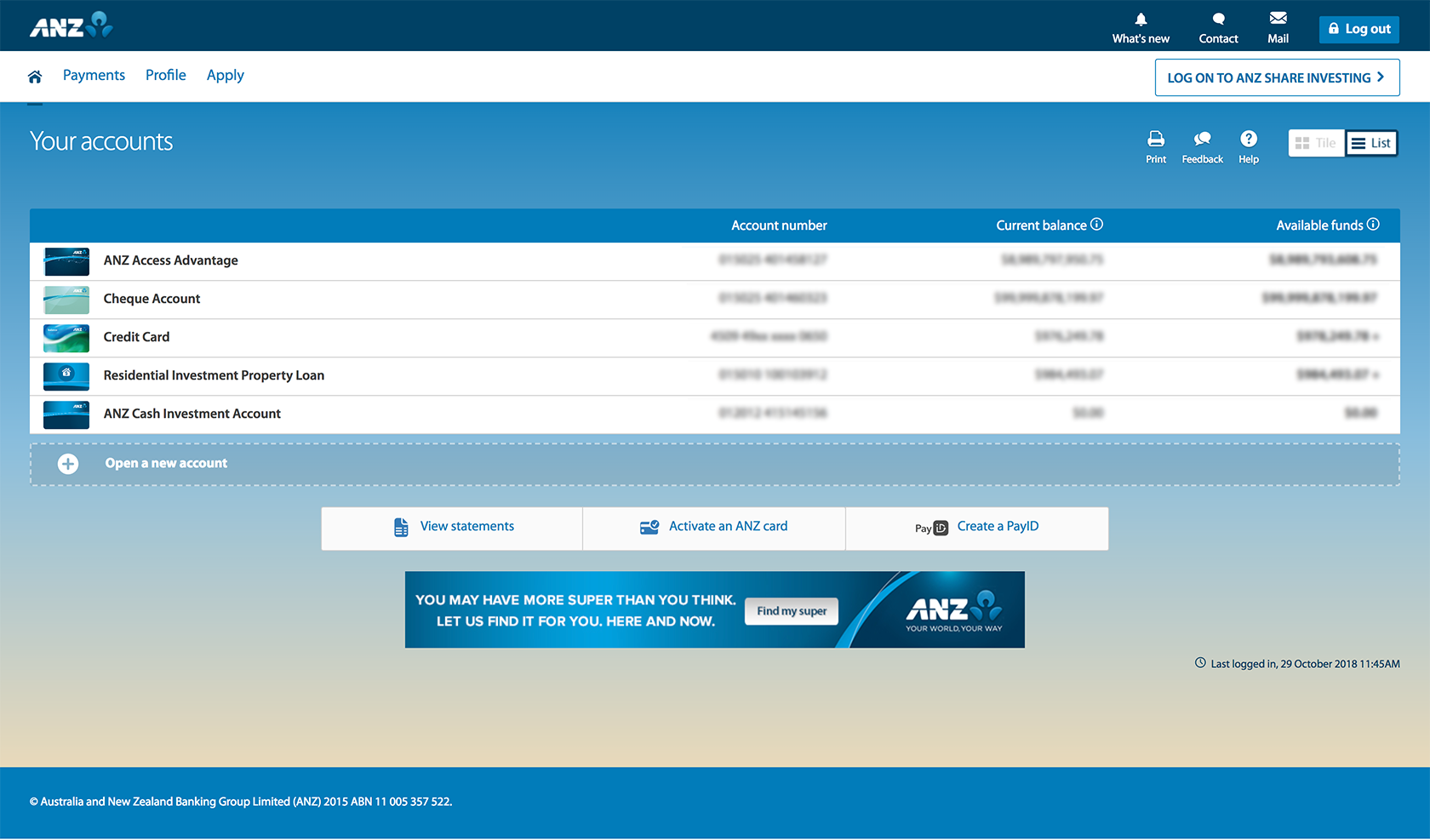
Internet Banking homepage (existing)
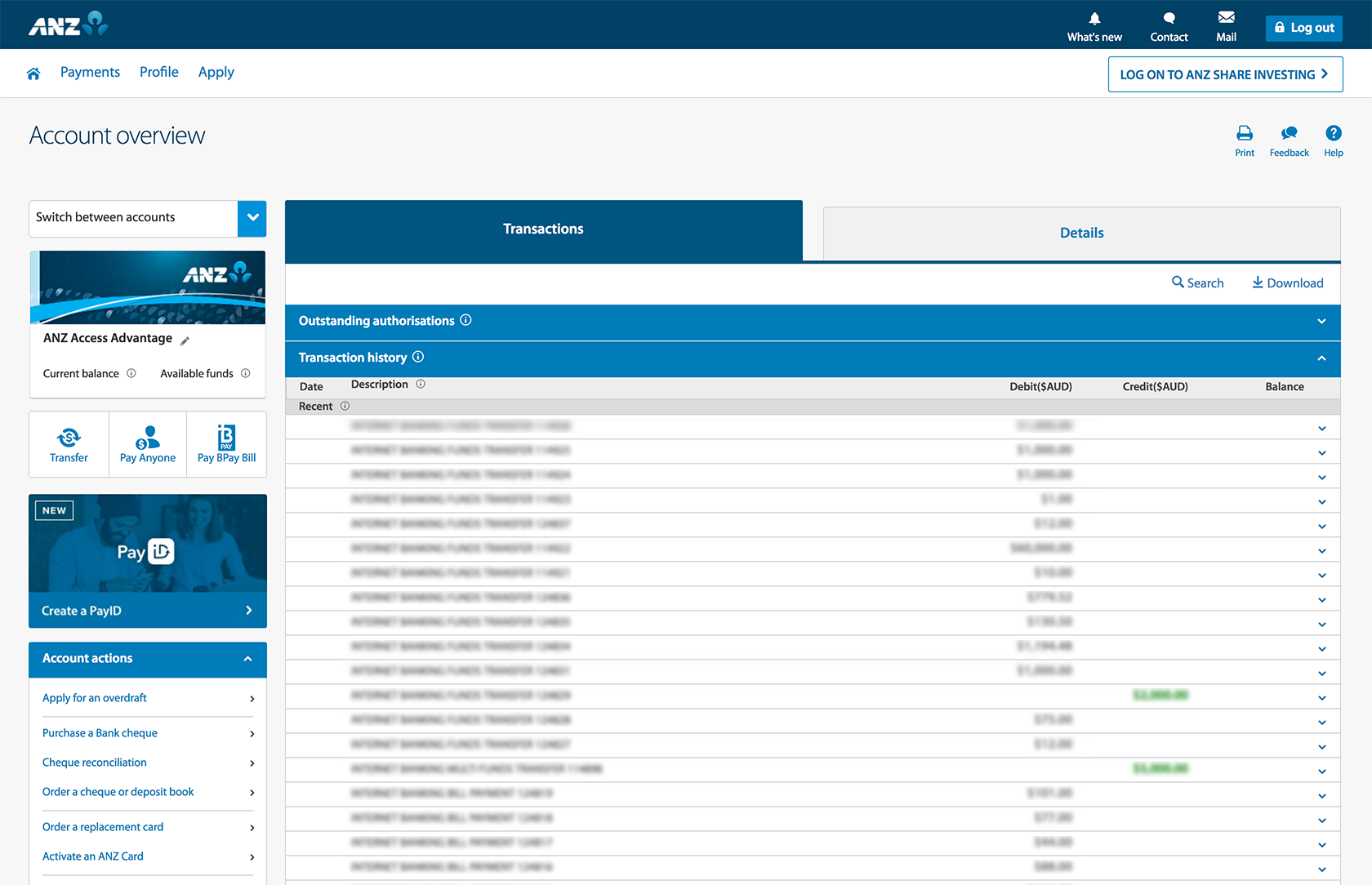
Account overview (existing)
The UI would address the following
In account overview, the elements on the left hand side looked cramped together. We reviewed and introduced hierarchy among the elements by
Increasing prominence of account balances, and customers key tasks CTAs which were difficult to locate. Moving the CTAs also brings more alignment with ANZ App layout.
Explored alternative ways for customers to navigate between accounts by introducing “Back to accounts” link at the top, as we were informed that the “Account switcher” drop down is not widely used.
Across both screens, we also proposed UI updates such as
Improve aesthetics by introducing maximum width on the fluid layout.
Reviewed UI styling such as introducing the blue bar “hero banner” to bring more consistency across with anz.com, ANZ app.
Agree on delivery approach
As we put forward the proposal to include the design uplift and presented concept designs from our visual designers, it was first met with reluctance. The general feedback was
“It takes a lot of work if we change anything, we don’t have time.”
“Why change things? Customers are used to it.”
I facilitated discussions between designers and product owners. We agreed to ensure that by incorporating the design process, delivery timelines will not be impacted. For further reassurance, Design also committed to
Milestones to validate and conclude testing on concepts with customers
As development will commence in parallel, stakeholders will be informed of the design process and pivot where necessary.
Assist with additional reviews and approval (e.g. Legal).
Itemise and prioritise updates with team in accordance with delivery timelines.
Research
Define research scope
Our next step was for us to validate the designs. To help us define our research scope, we reviewed the experience and created a list of our hypotheses and questions.
Have our questions got answers already somewhere?
We analysed the list to identify items where other design teams in the bank might have conducted similar research, we reached out to the teams accordingly. Not only this helps us to prevent doubling up on work, maintaining cross-team communication can help us achieve greater, more comprehensive outcomes.
For the items that are up to us to find out, we prioritise items to define our scope and methodology.
Would our questions also concern other teams?
During this process, we also discovered an opportunity to collaborate with the Sales tribe on this research, we reached out to them and the two tribes conducted this research together. This collaboration meant we could optimise our design resources, time and effort on the research.
Objectives and methodology
Our objectives were
Validate that the new design has no usability impact
Capture customers’ attitude towards the new UI design
Capture customers’ top online banking tasks to help us prioritise features and UI
We conducted testing on the journey from home page to account overview. All designers from both tribes divided the tasks. I was in charge of recruitment with our vendor agency, setting up screener and quantitative survey. We all took part in facilitating and note-taking in the interviews. We also had support from the consulting researcher in the Sales tribe when needed.
We ran the research in two parts – a qualitative research for us to get insights and feedback on the uplifted design from our participants, and a quantitative research that would provide us with data to support our findings.
In the qualitative research, we conducted interviews with a small group of existing customers. They were to perform tasks in the concepts in discuss their experience.
In the quantitative research, we conducted the survey with two cohorts, one was presented with the new design, the other with the existing design, the survey involved
Top tasks when banking online
Task based usability tests, evaluated based on task completes and self assessment on task difficulty
Word association on perception on the design
Stakeholder management and communications
Stakeholder management is paramount - it’s important to keep our teams informed through the process, particularly when the work spans across four product teams. I set up regularly meetings with all product owners and analysts for feedback, and shared updates from research planning and scoping, to communication of interim and final results.
The product teams were under great pressure to commence development. In order to maintain momentum for all, we agreed to provide interim insights as we progress with the research, so that development could continue. While this is different from standard workflow, product owners have acknowledged the possibility of the potential rework should the research suggests that the design needs to be reiterated.
Research results
The usability on the new design is proven satisfactory. Overall, research results showed that there’s no adverse impact on usability in most areas in the new design, which gave us confidence to proceed.
We have validated the following
Our uplifted design the accounts page, particularly the list view, is considered easy to scan and easy to compare accounts.
On account overview page, we have moved links to the top tasks as suggested by the product team based on customer feedback. All participants also told us they were now very easy to find.
We added a “back to accounts” link in account overview to observe its performance compared to the existing account switcher dropdown. When asked to switch accounts, Most used the ‘Back to accounts’ button to return to their account list and switch accounts. None of our participants used the account switcher – most didn't notice it.
The new design was well received. Most participants liked the new design. They felt it was an evolution, not a revolution. We heard words like simple, familiar and straightforward. All participants liked the consistency. It inspired trust. We found that most participants didn't mind change, as long as it still felt and functioned like ANZ.
“It’s the ANZ I’ve grown up with.”
"I want ANZ.com, IB and the App to be consistent.”
“[The] new designs are eye catching."
Our word association shows the new design maintains the same positive perception from the existing design, with emphasis on the new design considered more appealing. Perception on security was not compromised.
Outcomes
I worked with the product teams to finalise scope to develop our MVP by priortising design updates based on importance to feature release.
Since launch, we have been monitoring NPS feedback to measure impact on customer experience. Apart from the expected “change anxiety” in the first weeks, the rating has stablised.
We also continue to monitor feedback from our customers through your feedback form. Comments on the experience has been positive.
We now have a research backlog for the remaining items out of the this research, which will help us to deep dive into specific products and improve the research capabilities of the design team.