Scaleable Authentication
Serving 4.8 million customers across ANZ Internet Banking and Login + prefill online applications.
Project status:
Shipped
Role:
Product Design Lead
Team:
Sole designer from Identity team. Collaborated with teams from Internet Banking, Digital Sales, and Business Banking
Platforms
Web (responsive)
ANZ upgraded its authentication services, giving us the opportunity to redesign the login experience for the first time in seven years.
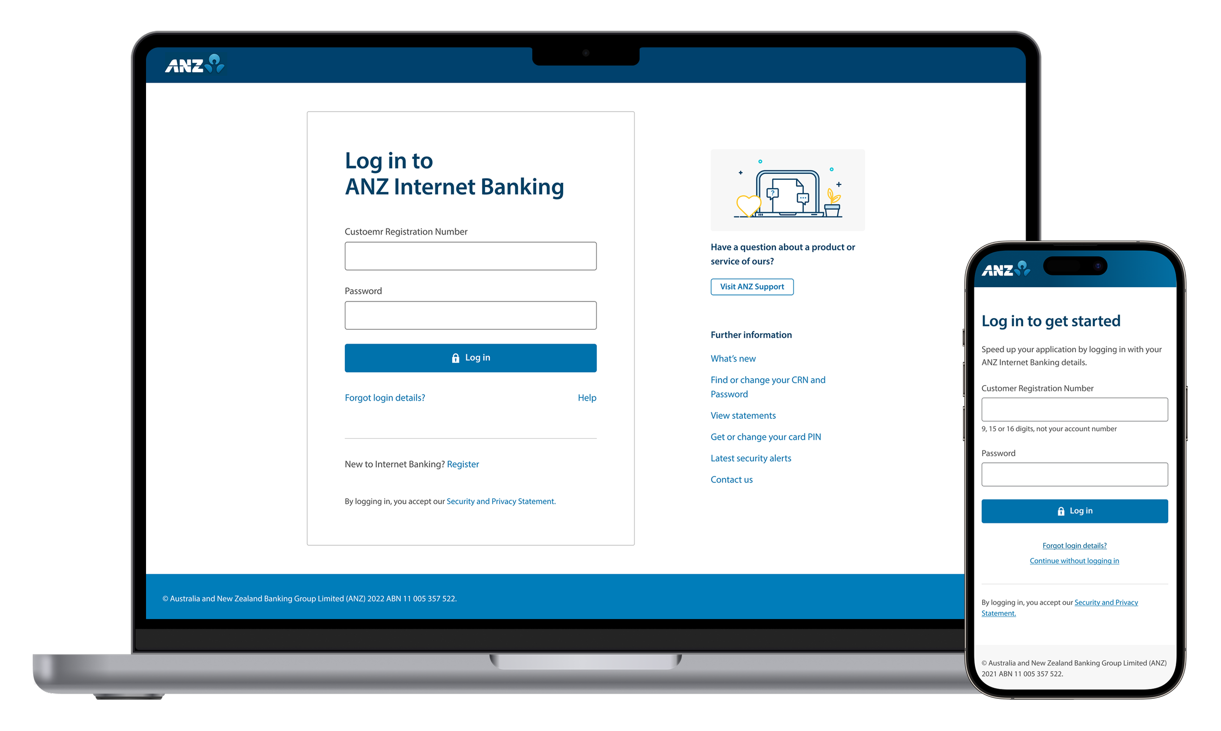
The log in feature was implemented over 2 phases - first in Internet Banking, then scaled to Login & Prefill online applications for existing customers.
At a glance
4.8m
Total customers serviced
18m
Logins monthly48.7k
Applications pre-filled monthlyMy role
I was the sole designer leading the design end-to-end, from conception, research planning to engineering hand-offs. Setting the design direction and collaborating with cross functional peers, design teams and leadership for optimal customer experience.
Part 1: ANZ Internet Banking
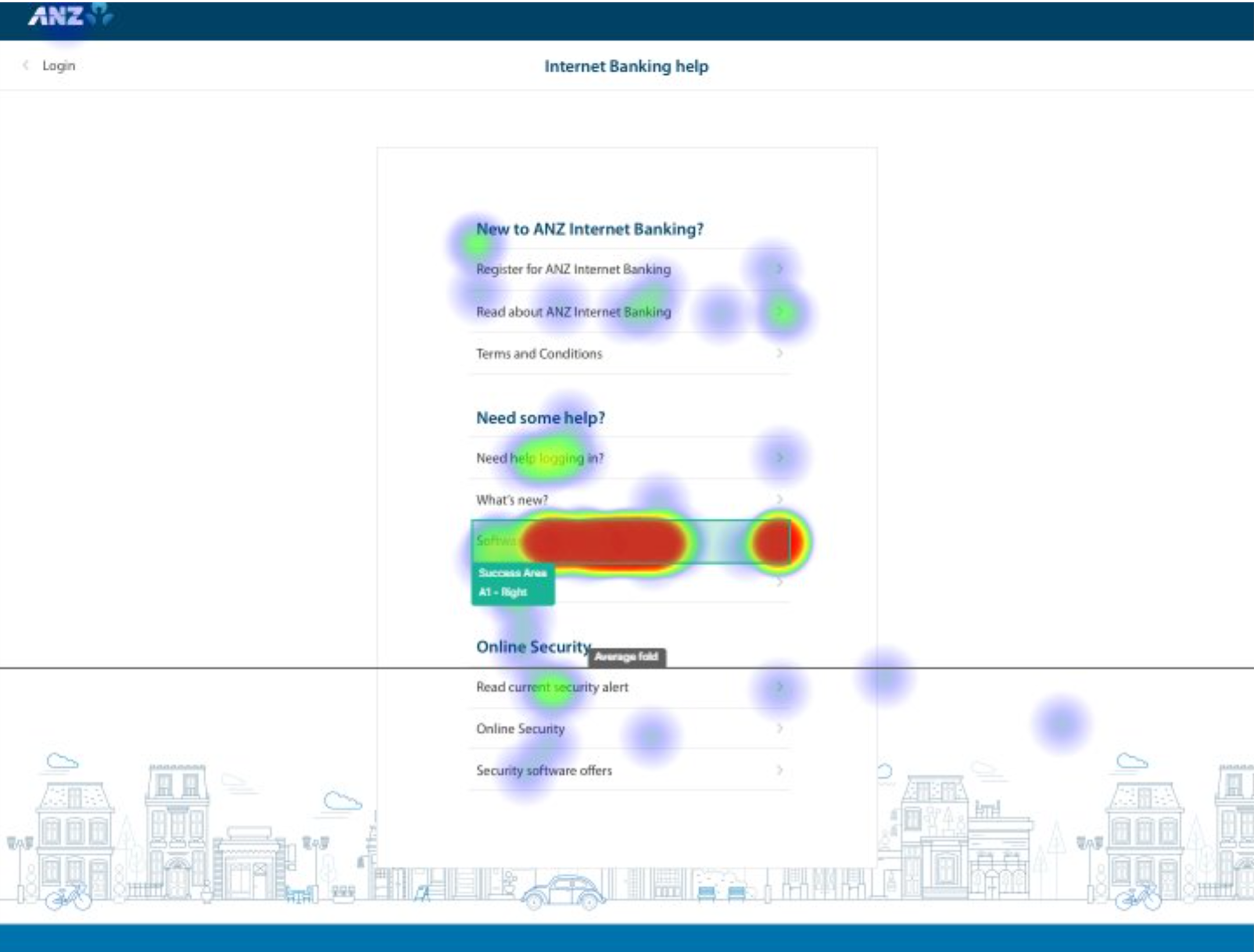
Designing a simple, focused login experience across channels
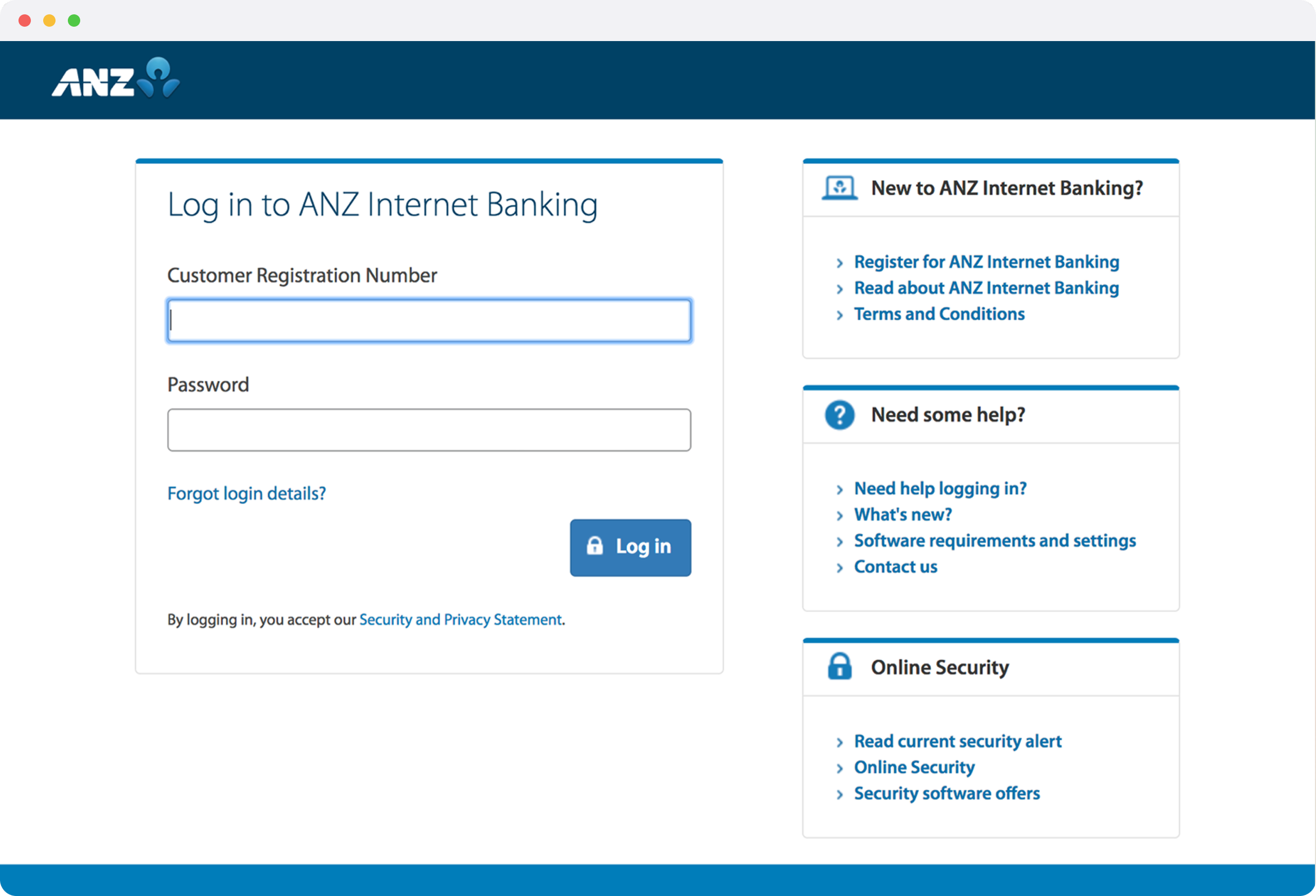
We reviewed the current design and conducted competitor research. The existing UI was visually cluttered with links competing with the login area, and its dated branding created a disjointed experience between ANZ.com and Internet Banking.
Design principles
I developed two principles to guide decisions throughout this work:
Simplicity Only what's needed for the task at hand.
Familiarity - Build trust through coherence
First Iteration
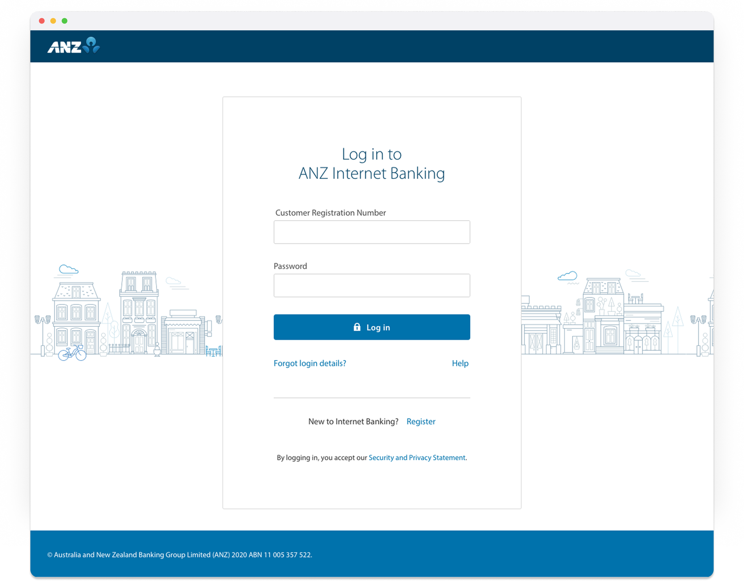
In the first iteration I stripped the page right back. I moved the links on the side to a new page under the help link, and added ANZ-style illustration for visual interest.
As I began socialising the design, the Personalisation team pushed back. Their concerns: the login page drove 1m yearly visits into ANZ.com, and they wanted alignment with the latest brand visual language.My next iteration needed to balance two teams' goals:Identity team: to create a focused, secure experience. Persoanlisation team: maintain pathways into their website and brand consistency.
Reiterate with Data
I was open to aligning the visual language but hesitant to retain all the links. I gathered four inputs to test whether each link earned its place:
Analytics
Links customers actually clicked.
Contact centre insights
What customers called about most.
Pathway analysis
Whether links were contextual to logging in, and if they existed elsewhere.
User testing
Which links customers found most important, and can they find what they need.
User testing
We ran a quantitative survey (n=76) with existing customers to validate:
Any links they would expect to see on the log in screen
Findability of the moved links using a click test
Their perception of marketing on the log in screen (as proposed by Personalisation team)
Key findings:
4 links were recommended to stay on Login screen
Findability of relocated links was confirmed
Customers were generally apathetic (neutral to positive) about secondary links
Marketing content was actively disliked — this supported our recommendation to keep the content-managed area minimal
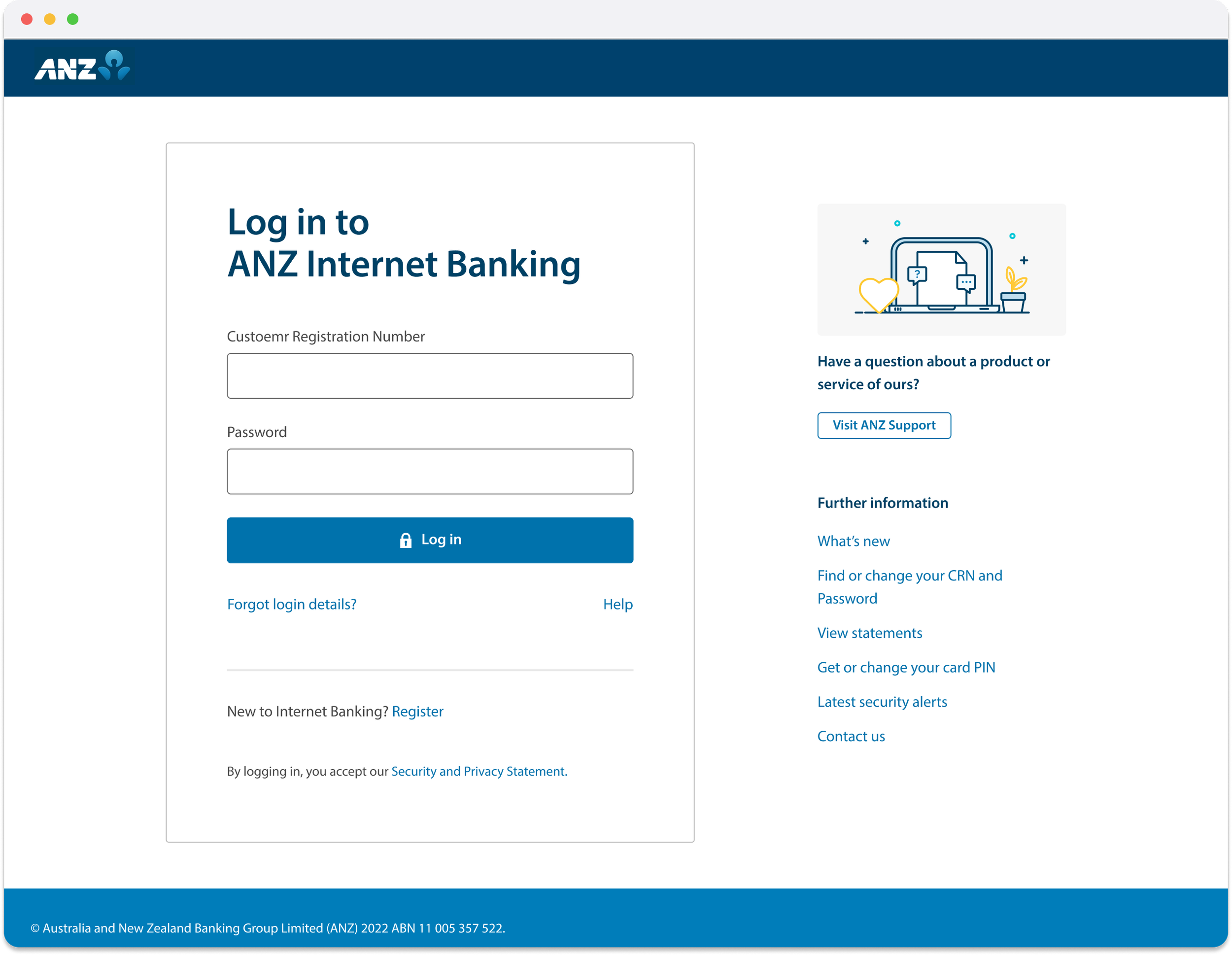
Part 1 - Finishing touches
The data validated our direction. We now reduced the links from 10 to 6.
I worked with Personalisation and Brand to apply the latest visual language, with guardrails for the content-managed area to maintain focus.
A second round of research (n=129) confirmed customers accepted the new design without friction, giving leadership confidence to proceed with minimal pre-comms.
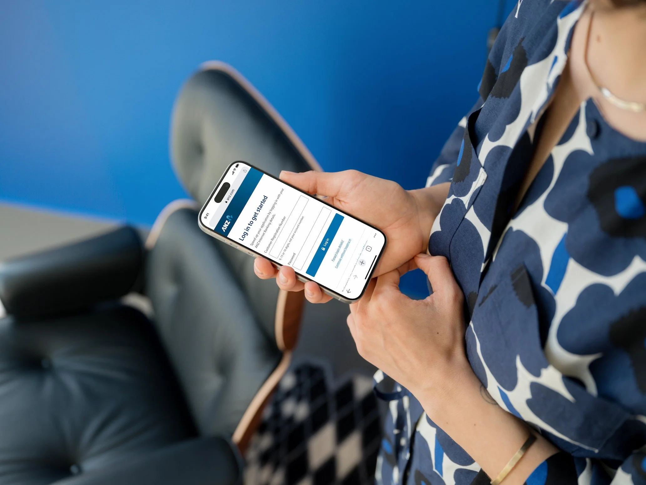
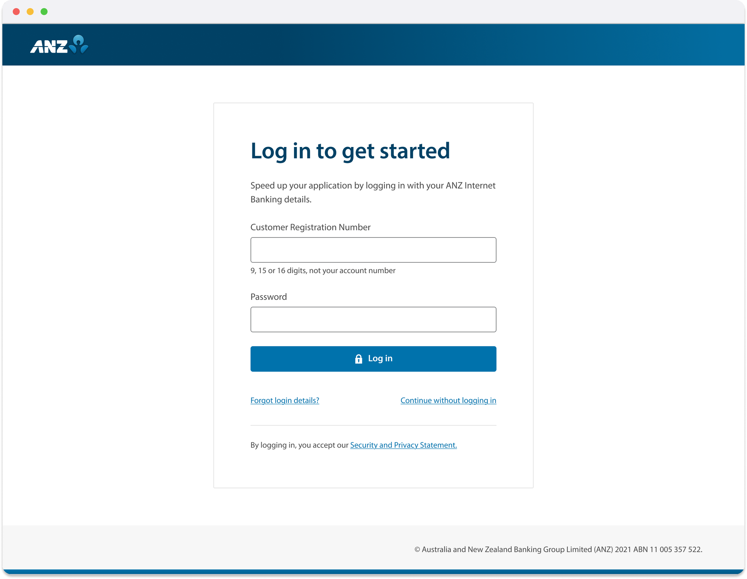
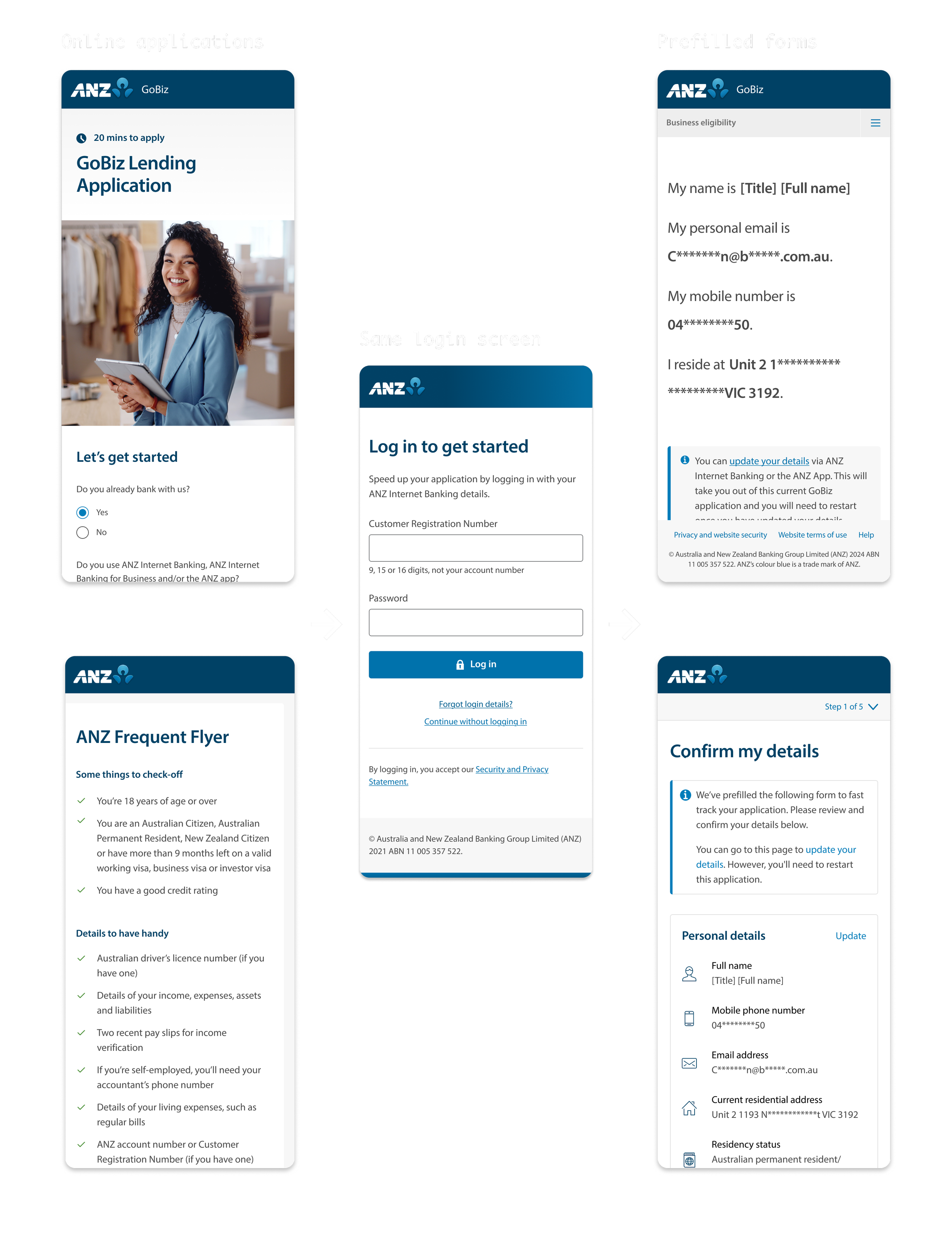
Part 2: Online applications Login + Prefill
The next phase extended login to ANZ's online application forms, allowing existing customers to prefill their applications.
I adapted the Internet Banking design for this context, following the same principles:
Retain core patterns - Same UI, messaging, and interaction. Familiarity builds trust. Reuse reduces engineering and QA effort.
Simplify further - Remove elements not relevant to applications (Internet Banking-specific links and personalisation).
Add "Continue without logging in" - Login should help conversion, not risk it. Customers who couldn't recall credentials could still complete their application.
Push back on customisation
Both retail and business application teams requested customisations, such as different UI treatments and launch patterns.
I pushed back: customers don't see separate products, they see ANZ. Any customisation would add build effort and undermine scalable authentication. The most important part is, when it comes to authentication, we need to maintain the consistency so that customer can trust putting in their sensitive details.
I used screen flows to show how the online application ecosystem connected to this feature. For business applications, I presented to their leadership showing the downstream implications of the customisation they'd requested. Once they could visualise it, I influenced both teams to maintain the existing design.
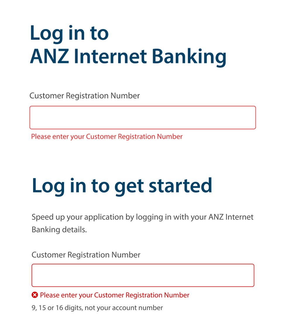
The retail team also requested custom content. I worked with a content designer to create unified copy across all applications, with a dynamic field for product name where differentiation was genuinely needed to provide flexibility.
That decision paid off. The same patterns later extended to SSO in the ANZ App.
Simplified login for 4.8m customers
Login securely serving 4.8 million customers with 18m logins monthly. Success rates remained stable through replatforming.
Outcomes
Single experience across
four channels
Internet Banking, Retail and business banking applications, as well as SSO via ANZ app
Optimised application for 19 products
Existing customers can log in and prefill their applications for 19 products across Retail and Business banking
Personalisation capability
unlocked
For Internet Banking log in, links are now reduced from 10 to 6 validated by research, which unlocked personalisation capability while maintaining a focused experience.